
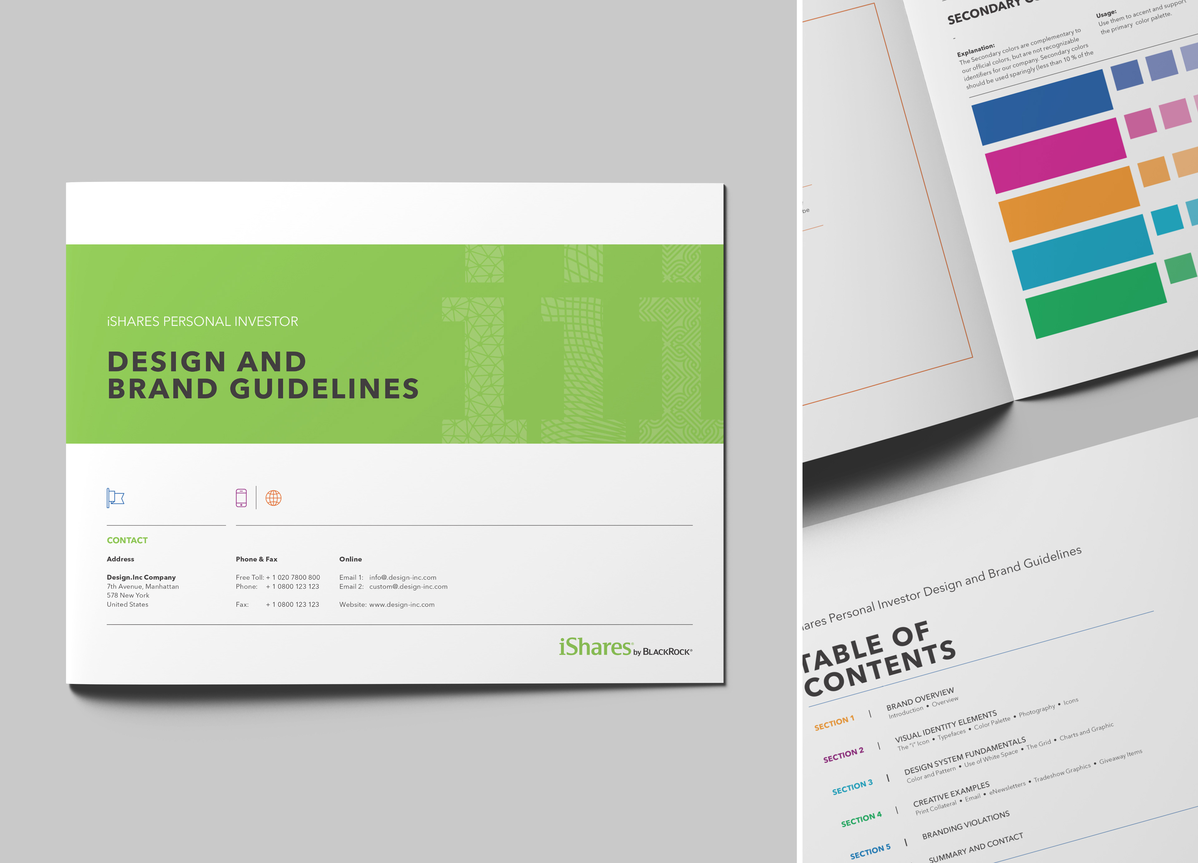
Sample pages from Brand Guidelines.
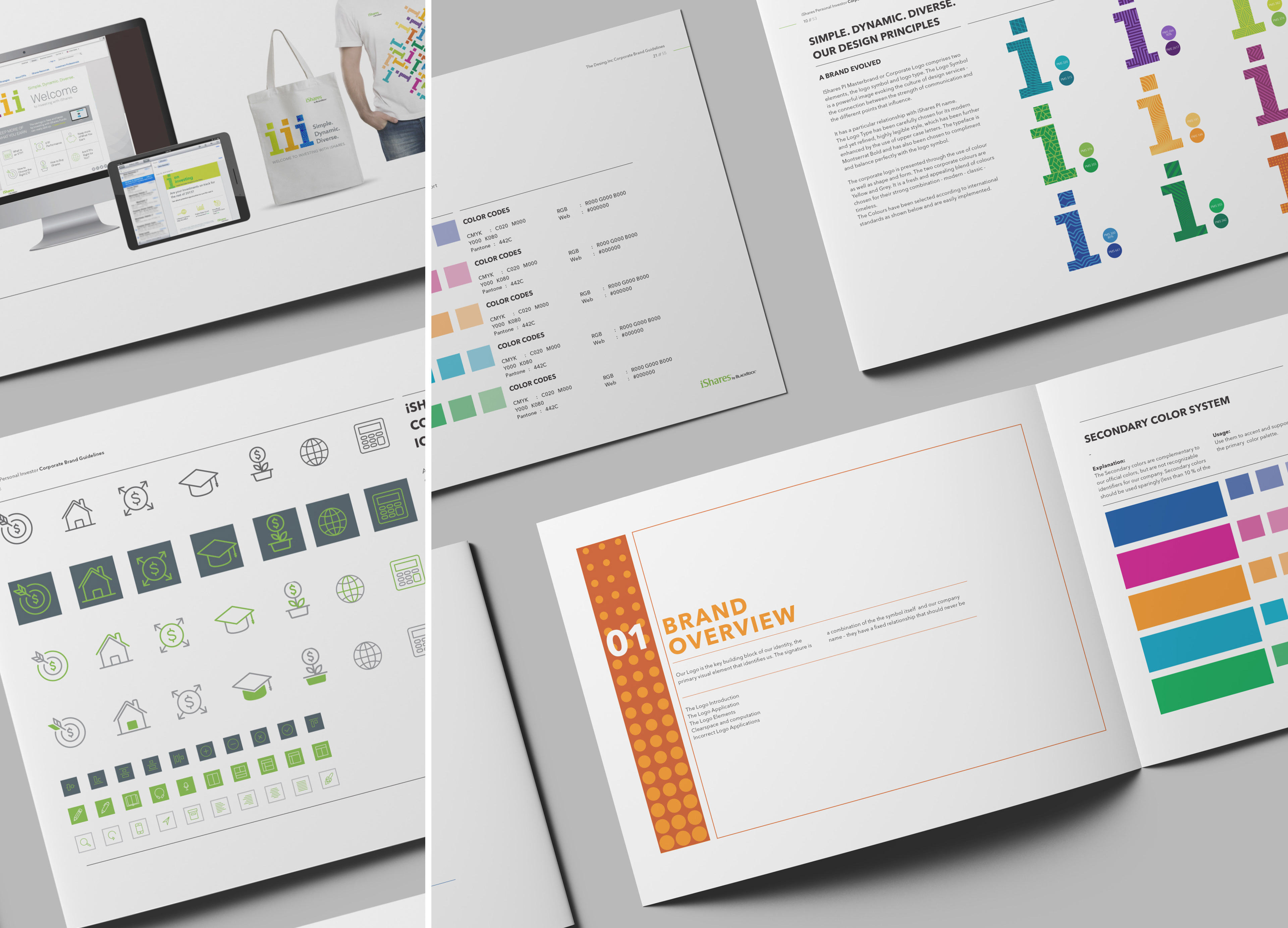
Sample pages from Brand Guidelines.
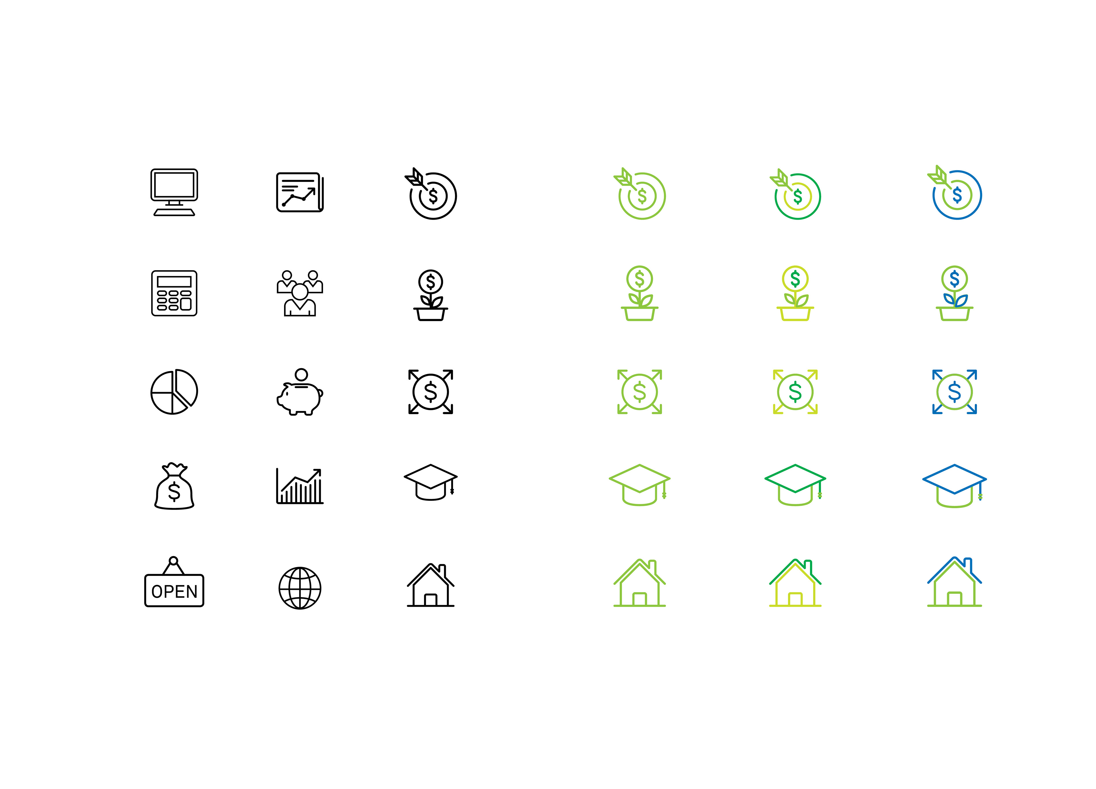
Developed a system of icons for the rebrand which included suggestions for how to color elements within the icons themselves.
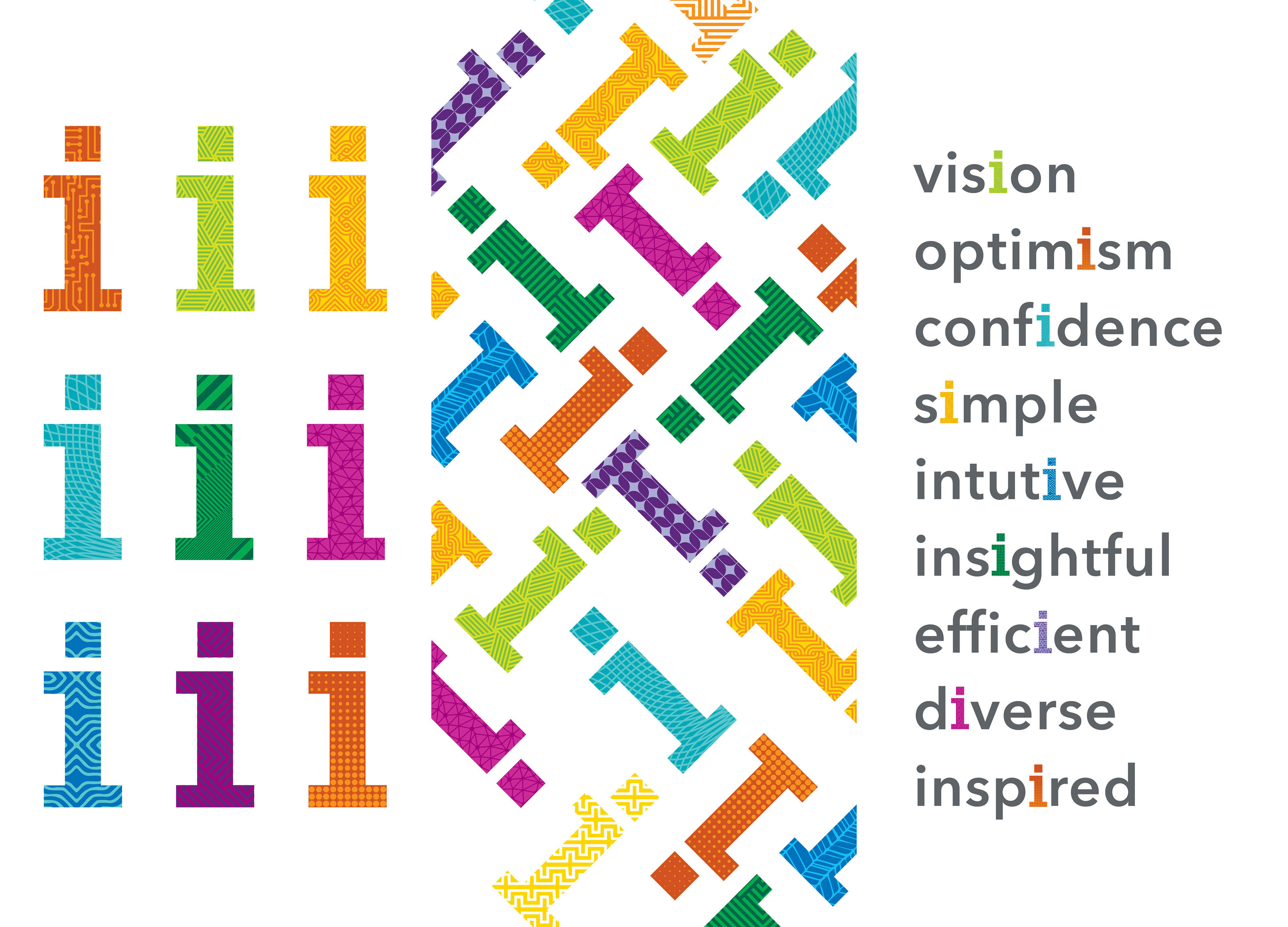
Developed a series of icons based off the original iShares green "i" icon. The patterns within the "i" symbols represent the various sectors and markets that make up iShares ETFs. The brand is consumer friendly, with the colorful i's shown in all communications. iShares and investing are synonymous with all positive words.

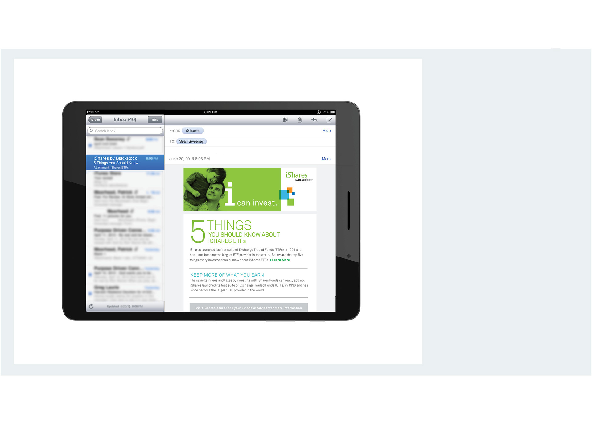
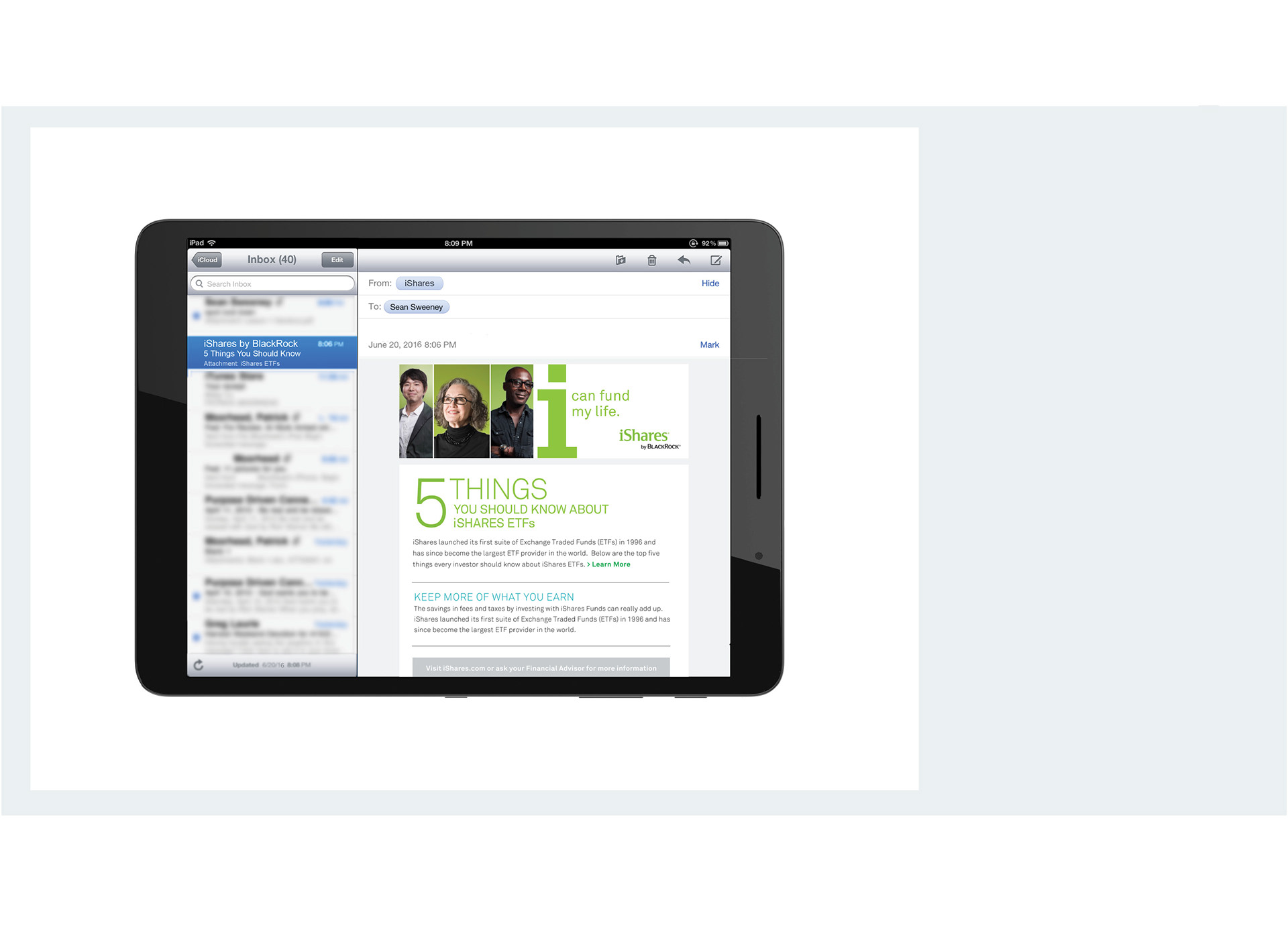
Branded iShares email with color palette, patterned i and icons in place.

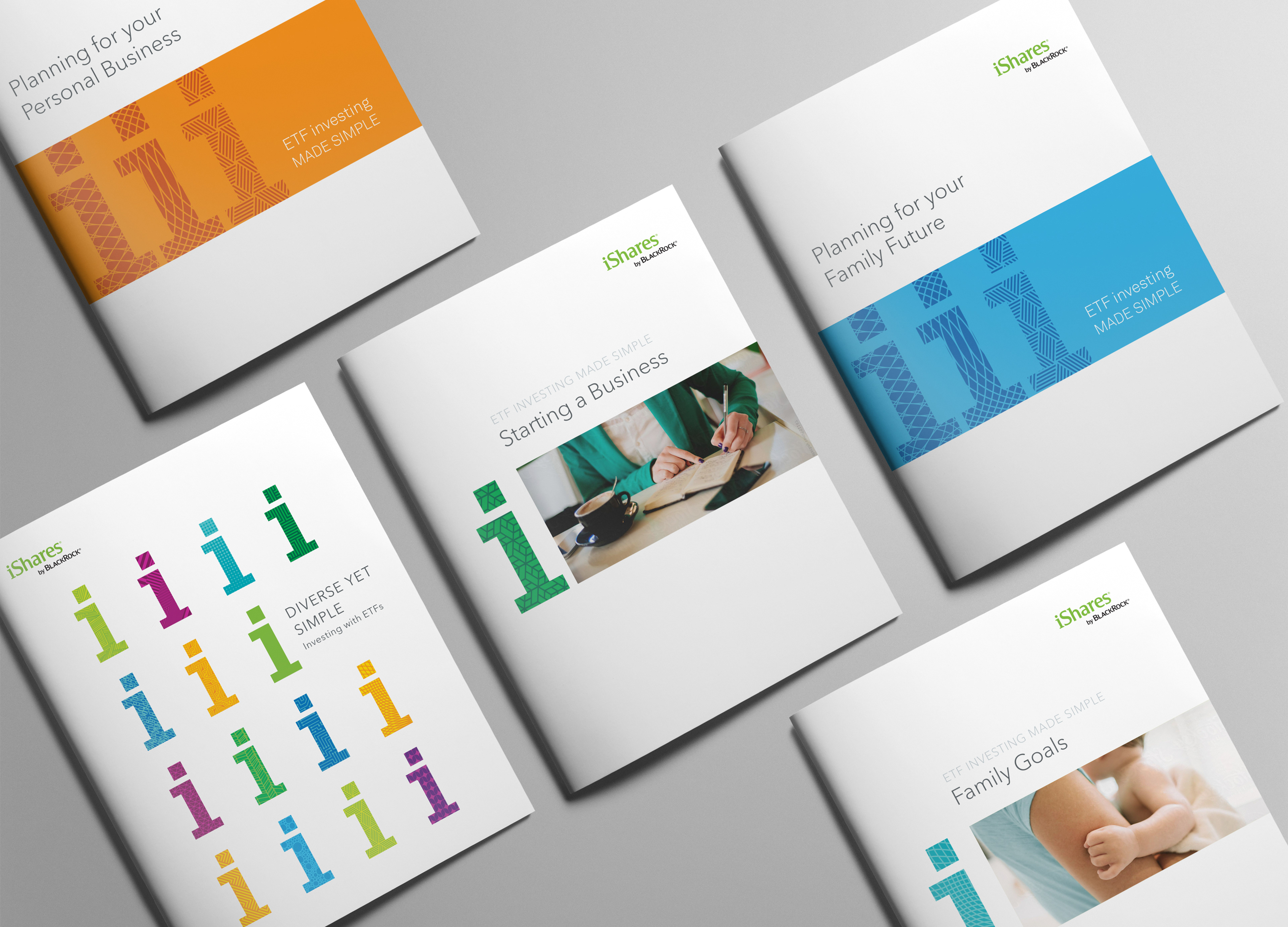
Sample covers for brochures covering a variety of topics for the individual investor.
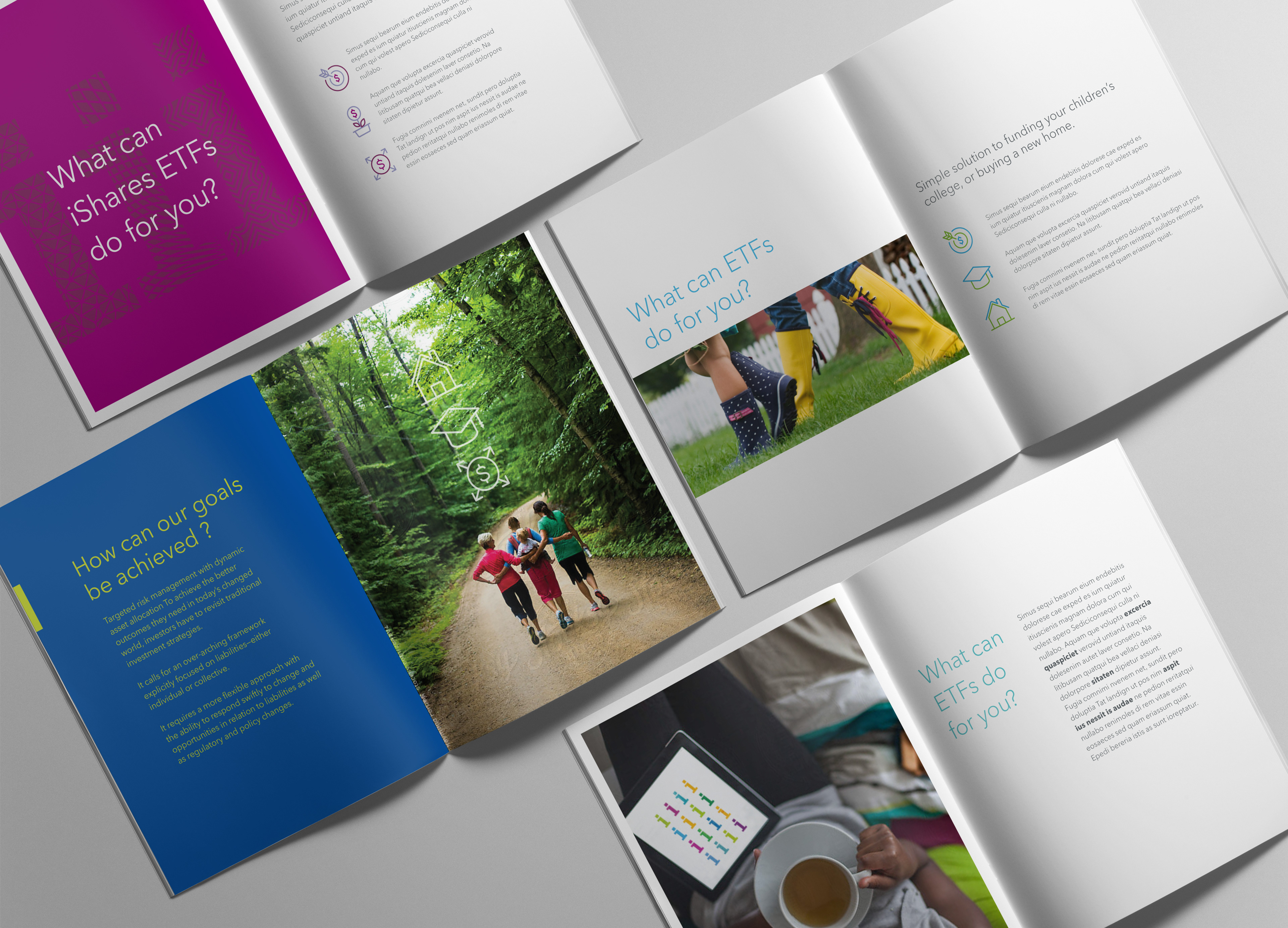
Corresponding sample spreads.
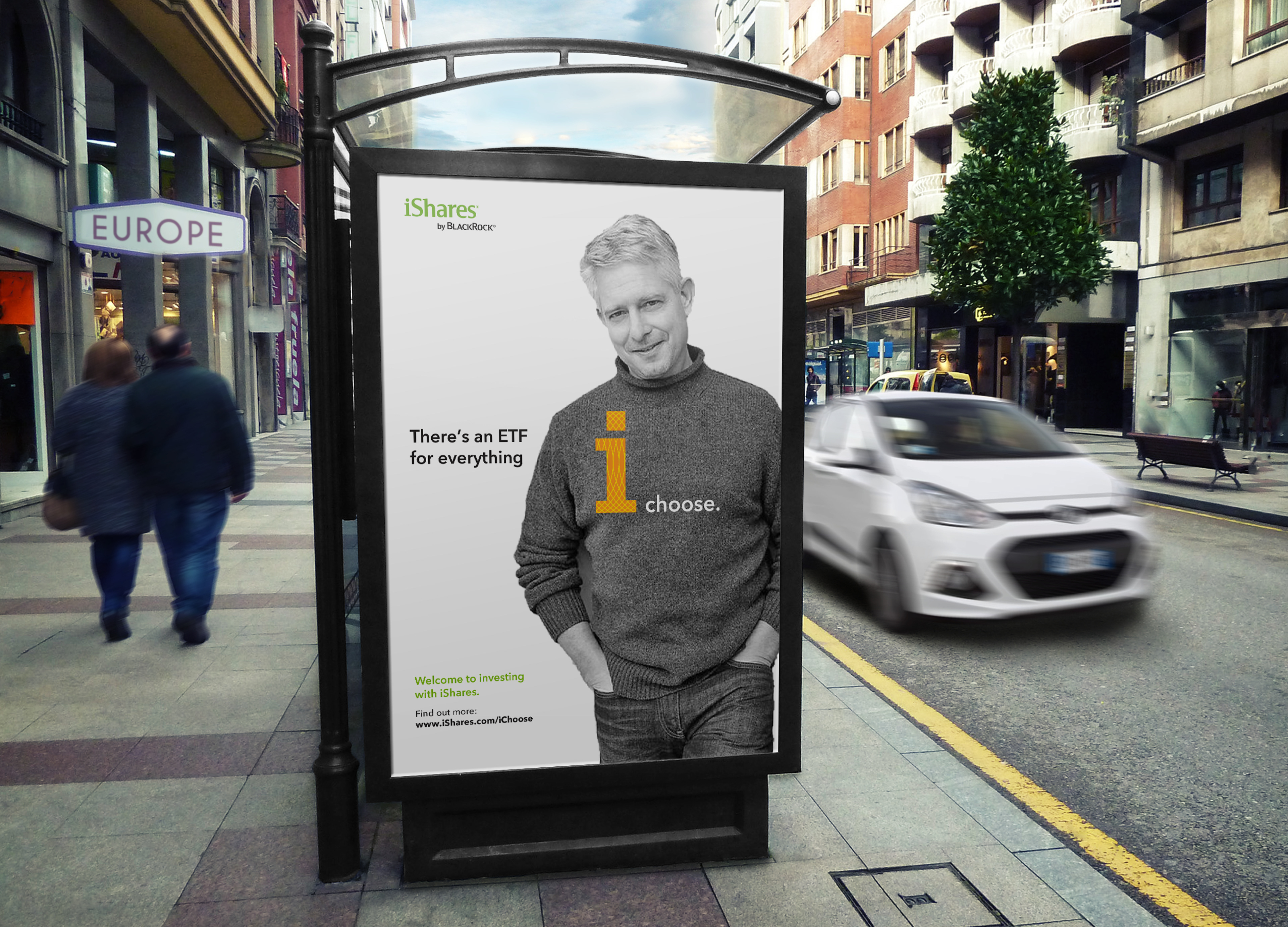
Proposed ad style and messaging.
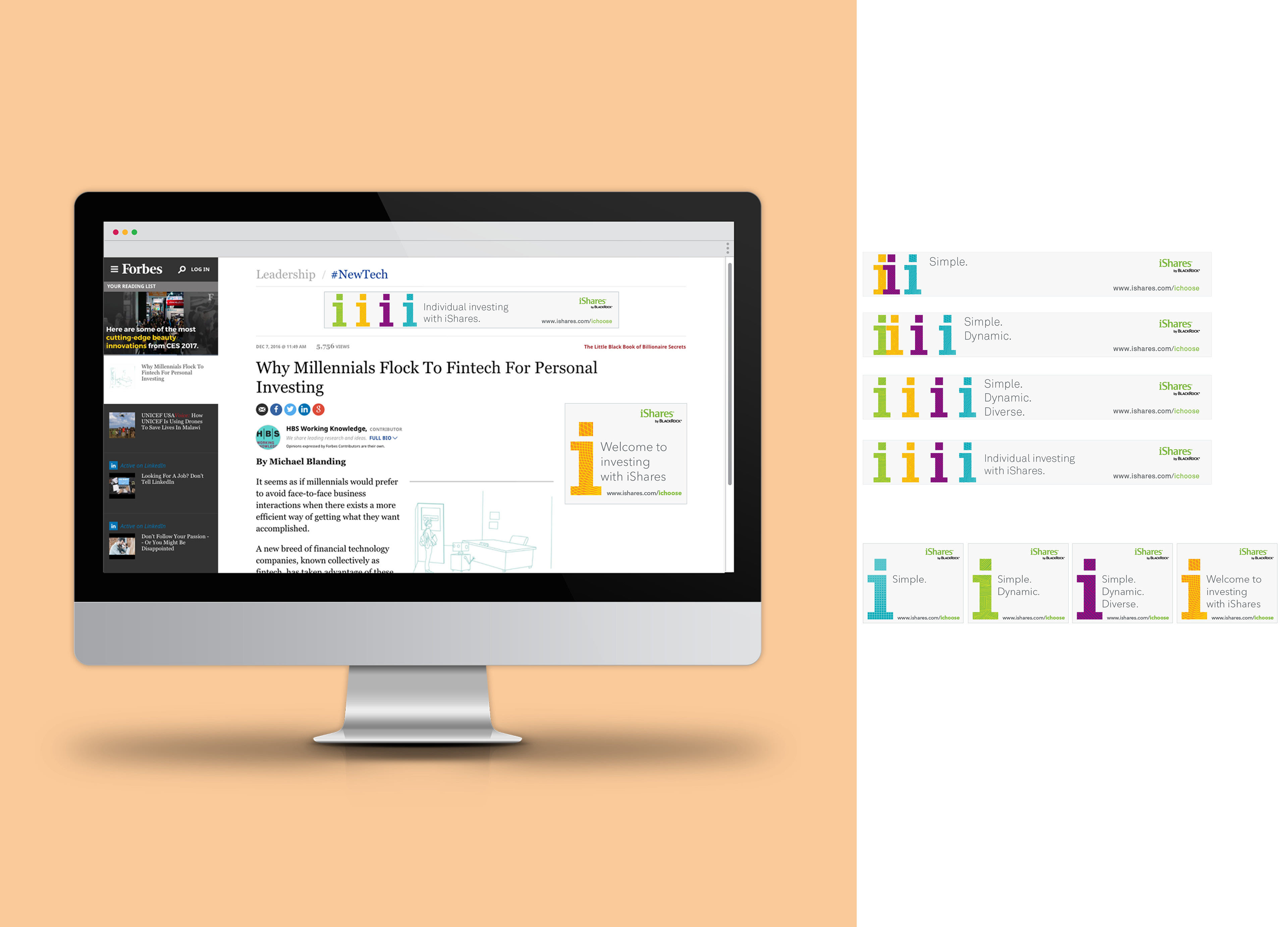
Animated site ads.
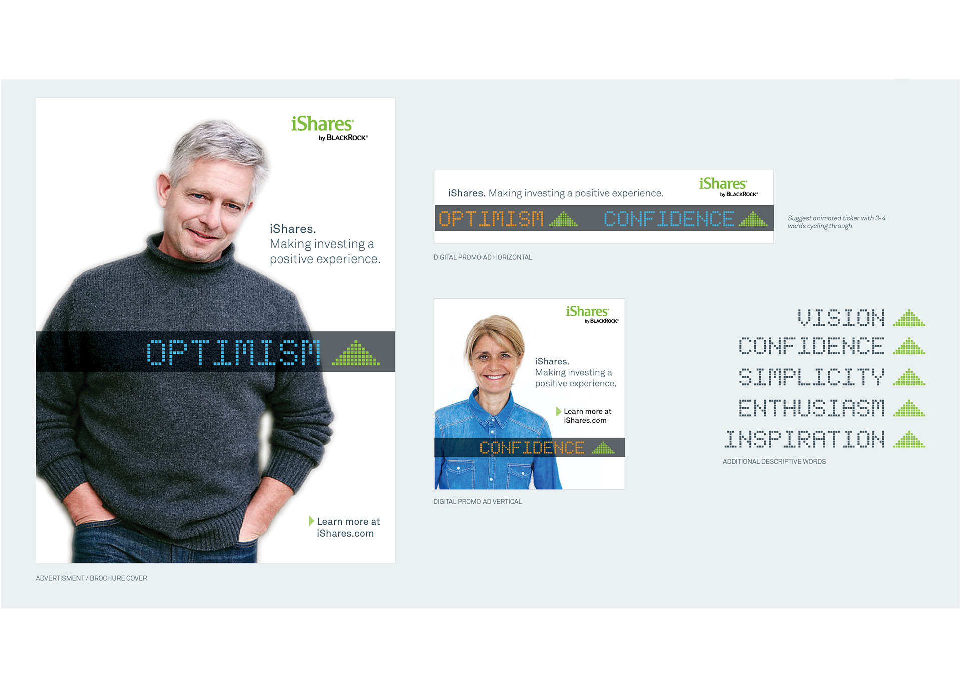
PROPOSED CONCEPT: Positive Tickers

Print Ad
Brochure Cover and Icons


Landing Page
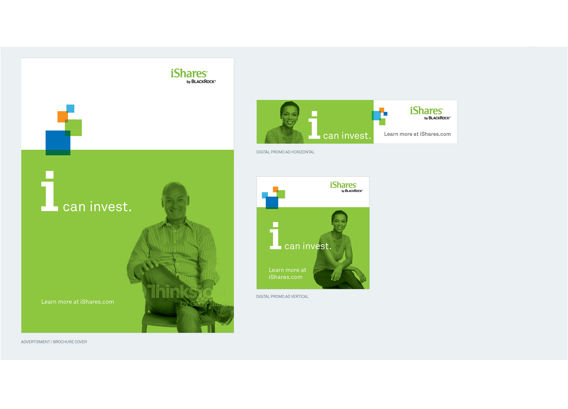
PROPOSED CONCEPT: i Can Invest Using iShares Ticker Squares

Print Ad
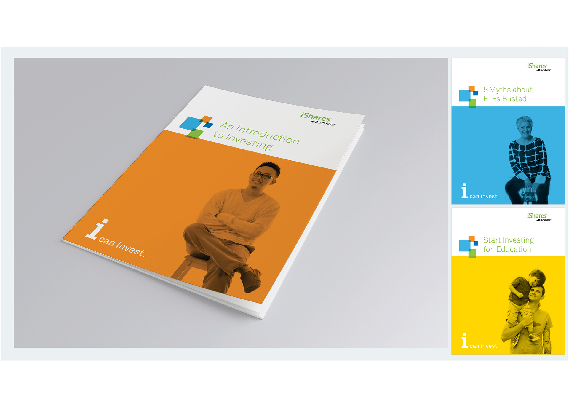
Covers

Landing Page
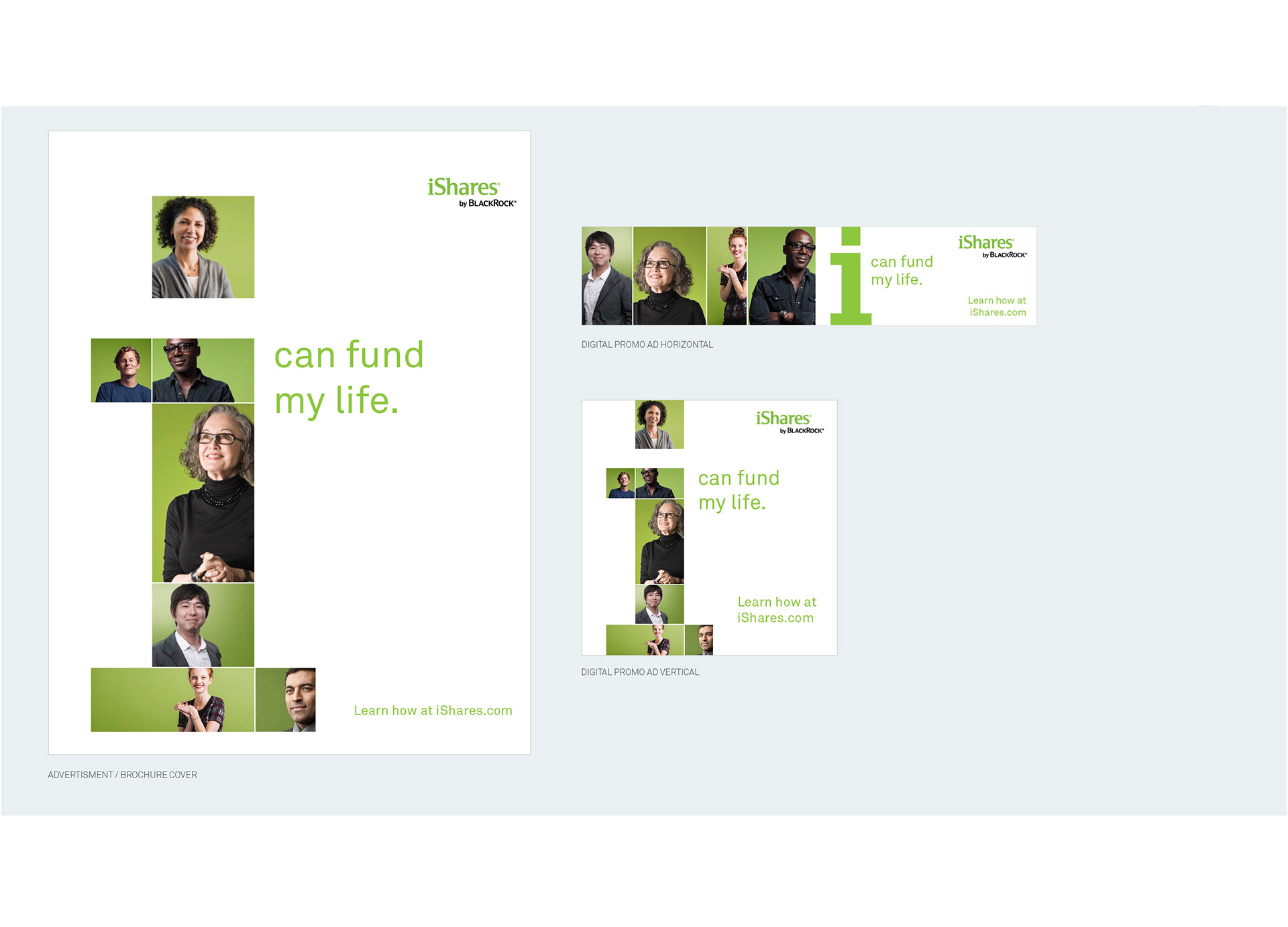
PROPOSED CONCEPT: i Can Fund My Life Mosaic

Print Ad
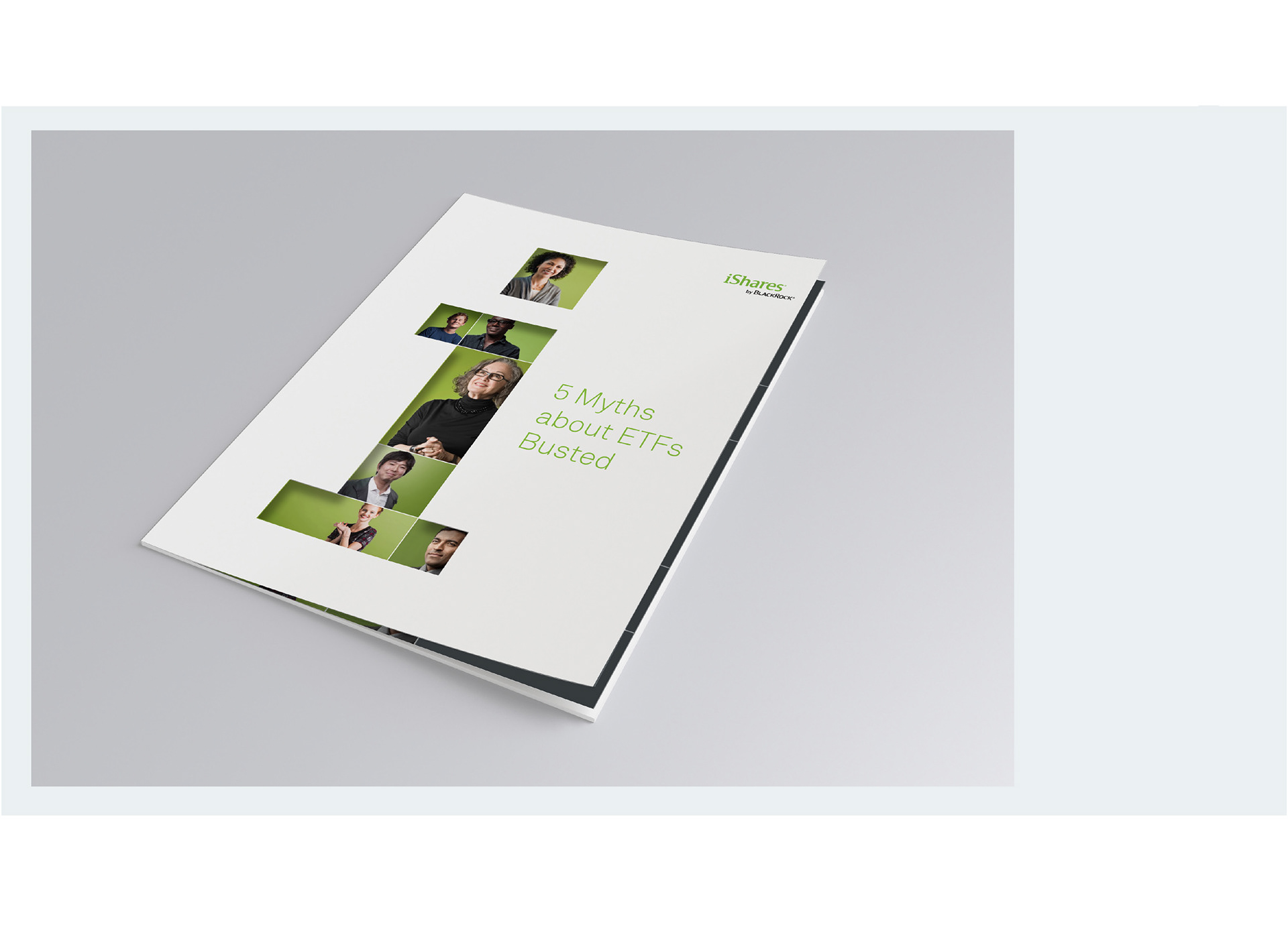
Die-cut Cover

Landing Page

PROPOSED CONCEPT: Invest in You and iShares Tickers

Print Ad
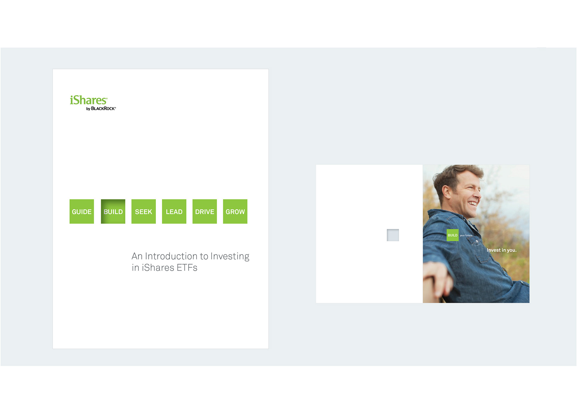
Die-cut Cover


Landing Page
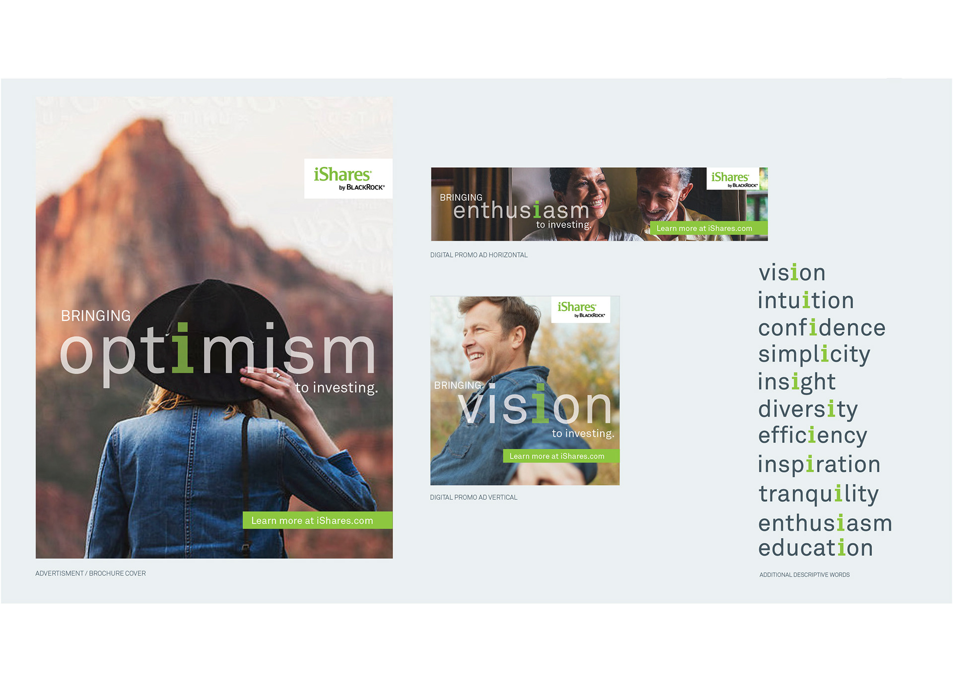
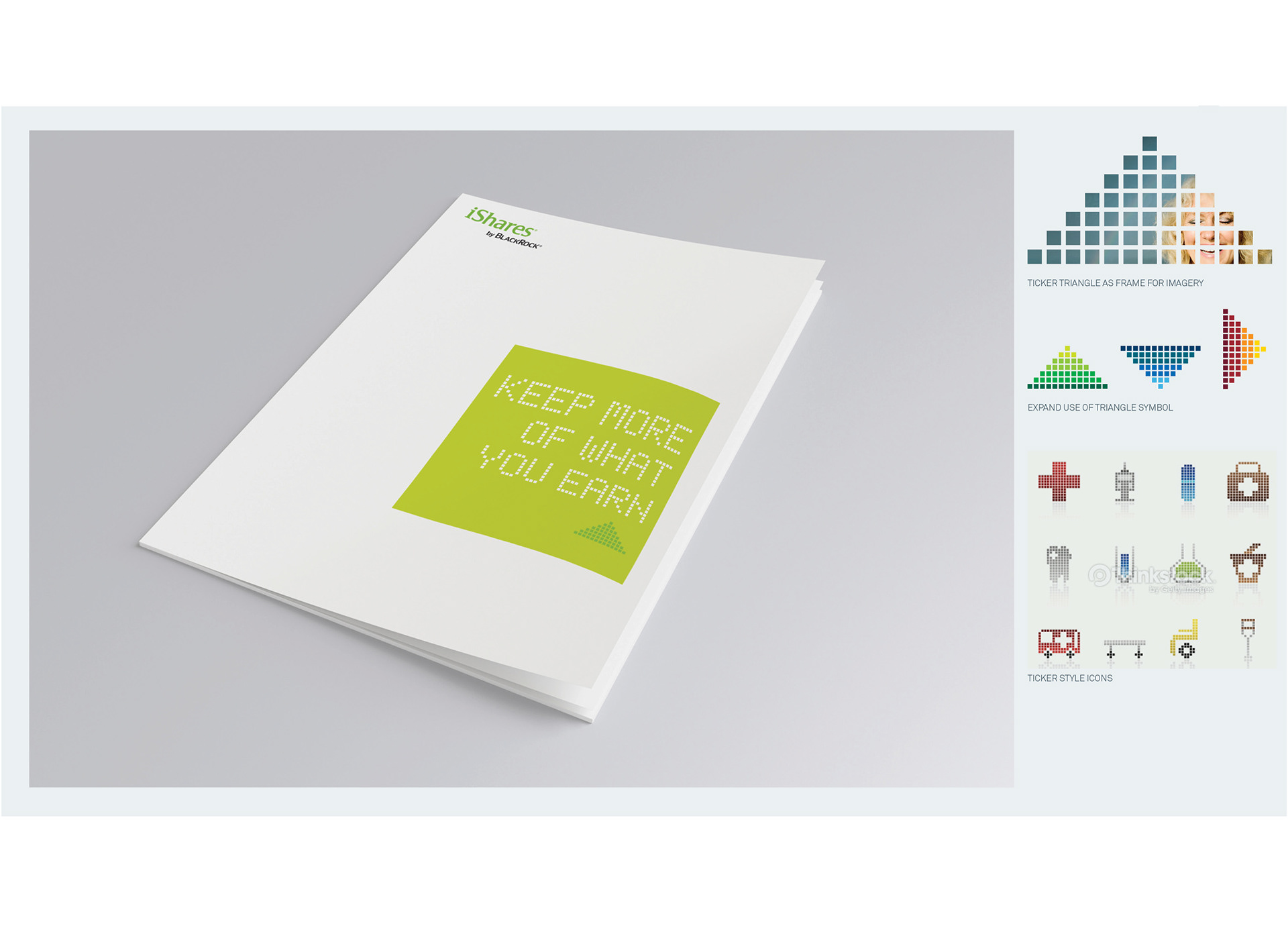
PROPOSED CONCEPT: Bringing Optimism to Investing

Print Ad
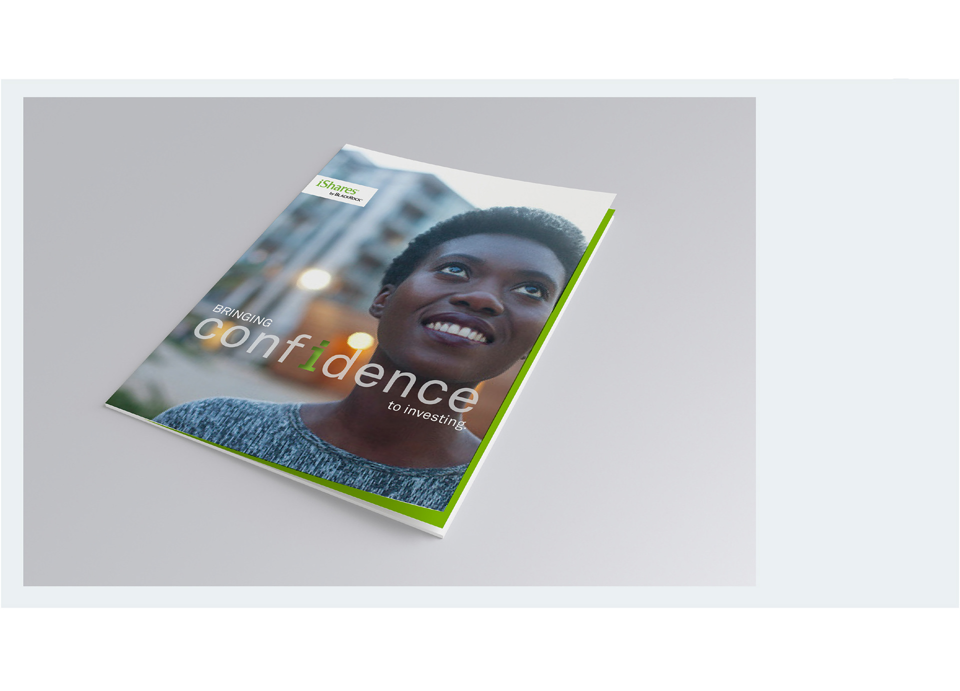
Die-cut Cover